This post is simply a quick link search repository for the YouTube channel "Office Hours".
You can find YouTube clips for any questions discussed on Office Hours, starting May 25th 2020
As a design firm started in 1984, BeOriginal has always been interested in new tools to help further our design capabilities. Our goal has always been to provide our clients with creative and insightful solutions to design problems. To do so we have consistently found the need to find and
Here's a photoshop file I've created for making custom folder icons for your desktop icons.
I use it on my personal and client projects to help keep things organized and easy to see at a glance.
Also, I use this great app, Icon Slate, for creating the actual icon files after I've
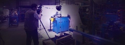
3 Quick tips for shooting video on location in the Atlanta Area.
This post addresses a very specific set up and filming, however, the techniques we use can be applied to many location shooting.
We have a great client, Winton Machine that has recently decided they need high
I was recently part of a team responsible for installing PTZ (pan, tilt, zoom) cameras at our local congregation. After looking long and hard for a quality and affordable solution, we ended up with two cameras from
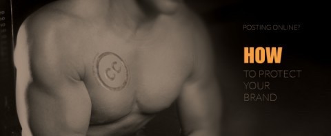
In this "Post & Repost World" of find it, link it, post it, I would like to take a minute and applaud those that acknowledge the creators of content. Quite often a post of a photo, illustration, video or even a clever quote goes uncredited. Most, if not all have been guilty of such at one
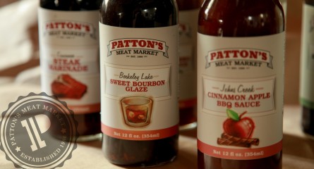
Patton's Meat Market
a locally owned and operated butcher shop based in Duluth Georgia has been working hard for the past 25 years to bringing quality meats to the community. In his desire to provide personal service to his existing customers, Parker Patton, the owner, found there was
Why it's difficult to be social and creative. But not impossible.
That is not a bad or good thing, it's just different. I think it comes down to ideas and time. There are too many things buzzing through my head that I would like to do
Looking for an Atlanta responsive mobile web design company?
If so you're in the right place. All sites we build are mobile responsive websites.
We make sure your website is formatted for iPhone, Android, Blackberry, iPad and any other tablet of any size. Mobile


-thumb.jpg)